BCozy Developer Guide
This documentation provides an overview of the BCozy software and its implementation.
The program structure, several elements and implementation details are explained to allow a better understanding of the software for future development and enhancements.
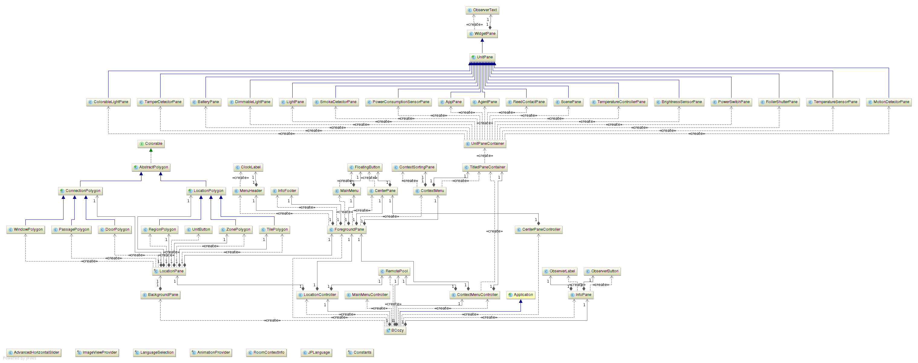
The following image displays a full class diagram of every class that is implemented.
Overall Layout
The overall layout is structured into at least two different layers and two menu areas as well as other floating elements. In the foreground (layer) the menu structures and main control elements are located and in the background the interactive floor plan is shown. On the left side one can see the main menu which is expandable to allow as much space as possible for the floor plan to be displayed. The unit menu is located on the right side and shows pane elements depended on the actual selection from the floor plan. The pane elements allow to observe current values and adjustment to new values. On the top the current time is displayed and at the bottom info messages can be shown, when necessary. Two floating buttons are located in front of the floor plan two allow direct actions manipulation of the view (switching full-screen and location plan mode). In the background layer the floor plane is drawn based on the information provided by the bco location registry.
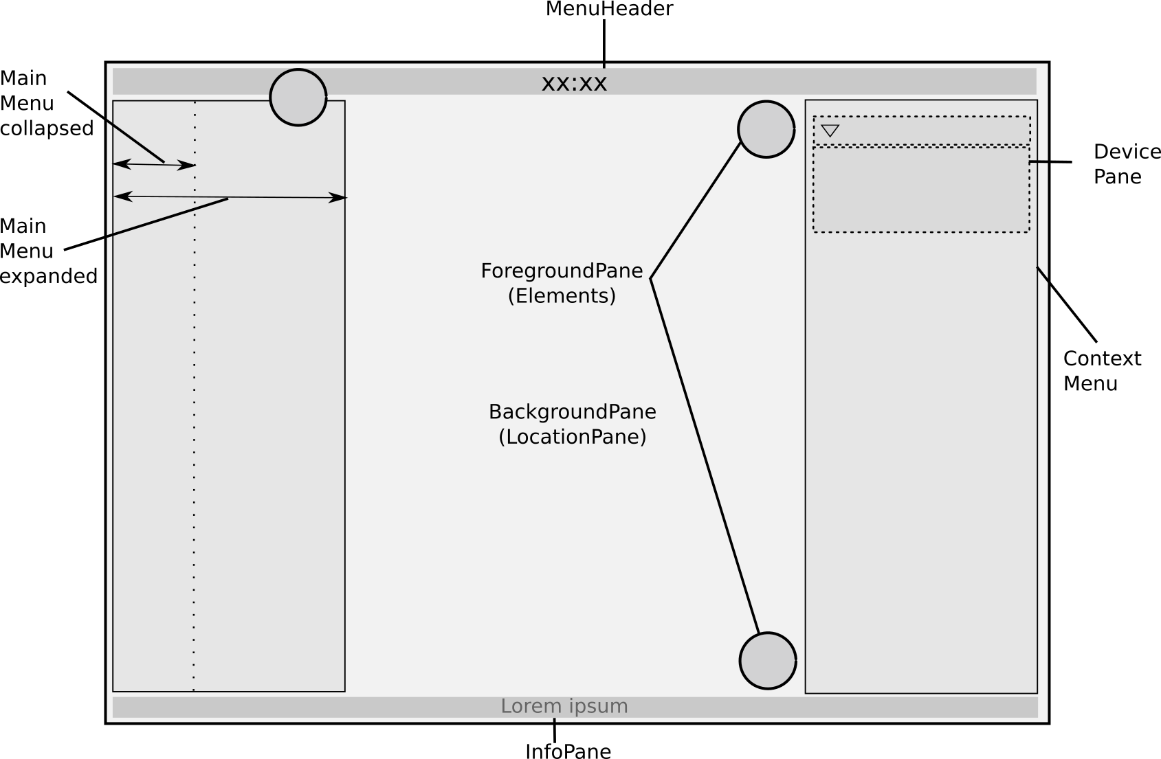
The main file bcozy creates the JavaFX Application and initializes the JavaFX Stage where a StackPane is added to combine the foreground and the background in one layout. Additionally the connection to the bco smart-home platform are established which provides the location, device and user data.
Main Menu
The main menu is defined in the MainMenu class. Its width can be toggled by the floating button at the top. Therefore two different layouts are used and the contents are added during the moment when the width is toggled, to avoid redundant elements in both. This is done in the maximizeMainMenu and minimizeMaiMenu methods.
The class also provides Getter-Methods for the various panes which are located within. This allows the distinction of the view and layout of the elements and the control logic in another controller classes. The panes are described in the following sections. For visual attraction most of the panes extend from the class PaneElement class which defines a material design style to make all panes look similar in the outer borders. The main menu is added to the left position of a BorderPane in the ForegroundPane class.
Connection Pane
The ConnectionPane class was developed to allow a graphical representation of the connection status to the smart-home platform. It is capable of showing incoming and outgoing data, showing an unknown and a fully functional connection status. The methods connectionEstablished, connectionProblem, uploadActive and downloadActive allow to trigger a status change / representation from outside the class.
The connection pane is shown the same way for the expanded and for the collapsed main menu. The graphical representation is realized through the combination of different sized SVGIcons in a GridPane Layout.
At the moment the functionalities are not connected to the RemotePool so the connection status is not shown yet. It has to be figured out which is the best way to check the connection status during runtime and request of data must trigger the upload method as well as receiving data should trigger the download method.
Login Pane
The LoginPane class implements the graphical elements for three different states that can appear. The pane should allow a user to login to the application which could be used for different modes (Admin, User, Superuser, etc.). In the beginning the state LOGIN is active. This state simple displays a Login-Icon. If this is clicked, the content of the pane is exchanged and the state is changed to LOGINACTIVE. Now a form is presented to the user which allows him to enter his username and a password. This must be confirmed with a click on the Login-Button. Wrong credentials are clearly visualized for a good user experience. If the login was successful, the state is changed to LOGOUT. The pane shows a user icon and a button which allows the user to logout of the application and return to the LOGIN state again. If the main menu is collapsed, the pane only shows an icon which represents the current state of the pane.
The pane was not connected to further procedures yet. The credential database must be provided from another application and checking which user is currently logged in, must be supported by the other parts of the BCozy application as well to make this useful. Right now the user "Admin" with no password is hardcoded into the application.
Available Users Pane
To show the current states of all residents of the home the AvailableUsersPane is used. It includes a list of all residents and visualizes if they are at home or on their way and, if they are at home, what they are doing. Additionally guests can also be represented there but they are only shown if they are at home. For each user a UserPane has to be created and the necessary informations should be provided as parameters during instantiation or must be changed with the setter methods afterwards.
Right now the collapsed main menu state has not been implemented for the pane yet. It was planned to show a user icon in the collapsed state and a little counter to display how many persons are currently at home.
Settings Pane
To consolidate general application settings the SettingsPane provides a vertical layout to which control elements can be added. The vertical layout is embedded in a TitledPane to allow hiding the settings whenever they are not needed. At the moment two drop-down menus provide the option to choose the application language and the application theme. For more details about that have a look at the sections (Special topics > Multilanguage support and Special topics > Theme support).
The TitledPane should have been replaced by a self developed CustomTitledPane. This is due to problems when resizing the application. Since there were problems during development and styling of the CustomTitledPane it was not changed yet.
Unit Menu
The UnitMenu class contains a vertical layout to structure all UnitPane instances in there. These instances are grouped in TitledPaneContainers to consolidate panes for the same functions. A hidden vertical scrollbar (realized with a HiddenSidesPane from the ControlsFX framework) allows a discreet scrolling and avoids distraction if it is not needed.
The unit panes or rather the widgets all have a basic structure. They are explained in the next chapter.
Unit Panes
The BCozy application includes different UnitPanes for each UnitType BCO provides. Units itself are used as abstraction layer by allowing the control or state introspection of modular hardware (devices) and software (apps) properties. Each UnitPane is implemented as own class with the self developed widgetPane as a model (explanation in chapter Self developed widgets).
The main structure is a combination of two panes, a central pane and a sub pane. Depending on the individual unit itself, the sub pane is optional. The central pane is used for orientation in a long list of units of the same type. Furthermore it shows the most important information of the unit. At this juncture all central panes of the units have the same layout (borderPane). On the left side of the borderPane a gridPane is placed. Each unit has at least an individual icon for visualization of the current state. Optionally, the gridPane has a second symbol (some text or rather an information value). Additionally the gridPane holds a toolTip with information about the current state. The text is bound to the current chosen language and resolved via the languageSelection, which is explained in the chapter below. In the middle of the central pane the individual unit name is set. On the right side an optional toggle switch can be used to de-/activate the unit. Examples of the different central panes are shown in the images below.


The second pane, the sub pane, is used to show more information and, if possible, to adjust the unit. By double clicking on the central pane the system scrolls the sub pane up or down. By default, the central pane is visible only and thereby the user has a better overview above the list of units. The content in both panes are specified to the individual unit. For example the colorable light has two selection areas for color choosing and the dimmer light has a slider for the brightness and the power consumption unit has a information textfield.
The table below shows all implemented unit panes with information about the visible information and the settings, which can be regulated.
| Unit pane | Notification of | Regulation of |
|---|---|---|
| AgentPane | power state | power state |
| ColorableLightPane | power state, color | power state, color via saturation/brightness & hue |
| AppPane | power state | power state |
| BatteryPane | battery state | - |
| BrightnessSensorPane | brightness state & value | - |
| DimmerPane | powers state, brightness value | power state, brightness value |
| LightPane | power state | power state |
| MotionSensorPane | motion state | - |
| PowerConsumptionSensorPane | state, current consumption, total consumption, current voltage | - |
| PowerPlugPane | power state | power state |
| ReedSwitchPane | contact state | - |
| RollerShutterPane | height state | open, close, gradual height |
| ScenePane | power state | power state |
| SmokeDetectorPane | smoke & alarm state | - |
| TamperSwitchPane | tamper state | - |
| TemperatureControllerPane | actual & target temperature | target temperature |
| TemperatureSensorPane | temperature state and value | - |
Automatic Generation of Unit Panes / Connection to DeviceManager
LocationPane / Floor plan / Background Pane
The background of the graphical BCozy interface consists of the LocationPane which is responsible for the visualization of the floor plan. The following diagram shows the dependencies between the main class, the LocationController, the RemotePool, the LocationPane and its underlying objects.
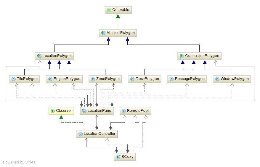
The LocationController is instanced by the main class and is responsible for retrieving the needed data from the remotePool via its methods fetchLocations() and fetchConnections(). These methods will use the remotePool to get access to the required remotes and then fetch and transform all coordinates from every location and every connection. Afterwards the locations and connection will be passed over to the LocationPane by the use of its methods addLocation(...) and addConnection(...).
The LocationController uses the Observer pattern in order to get notified every time when a change in the data of the LocationRegistry is detected. In this case all of the current data will be discarded and fetched once again.
The LocationPane owns three HashMaps which consists of every polygon object that needs to be drawn. When a Location or a Connection is added to the Pane, a corresponding polygon gets created according to the type of the location/connection and afterwards added to one of the HashMaps. A LocationPolygon can either be created as a TilePolygon, a RegionPolygon or a ZonePolygon, while the possible variants of a ConnectionPolygon are DoorPolygon, PassagePolygon and WindowPolygon.
The abstract classes LocationPolygon and ConnectionPolygon are subclasses of AbstractPolygon which is abstract as well and furthermore implements the interface Colorable. This makes sure that every polygon that is drawn onto the LocationPane implements the capability of having a primary and a secondary color which can be changed dynamically, depending on the current status of the location/connection. E.g. a window that is open can be drawn in a different color than a window that is not.
Shape Subtracting
Since all of the polygons consists of transparent elements in order to match the groundplan-like design, they can not simply be drawn on top of each other. E.g. if a DoorPolygon is drawn on top of two TilePolygons the Tiles walls would not be erased in the area of the door, while there is in fact no solid wall. In order to cope with this problem the shape of every tile gets modified whenever a new connection is added to the LocationPane.
To do so, the method addCuttingShape(...) from the LocationPolygon class gets called with the shape of the connection as the parameter. In the following the connection shape gets subtracted from the current location shape via Path.subtract(...) and set as the new cutting shape via setClip(...).
User Interaction (Dragging, Zooming, ...)
To allow the user to interact with the background pane via dragging, the setOnMousePressed(...) method is used together with setOnMouseDragged(...). Whenever a mouse click is detected on the background pane, the coordinates of the mouse are stored. If the mouse gets dragged afterwards, the location pane gets translated according to the difference between the saved and the current mouse coordinates.
The interaction of zooming is achieved by making use of the setOnScroll(...) method. A certain scale factor gets calculated according to the direction of the scroll and afterwards applied to the location pane via its setScaleX(...) and setScaleY(...) methods. In order to apply the zoom towards the current center of the screen, the scale factor also gets applied to the translation values of the location pane.
When the user performs a double click into a specific tile or region, the location pane performs a smooth transition towards this location, which means that scaling and translation factor will be adjusted in a continuous matter. A ParallelTransistion is used to achieve this. Multiple transitions can be added to the ParallelTransition which will then be executed in parallel. In this case a ScaleTransistion and a TranslateTransition are calculated and afterwards executed together via the play() method.
Layers on the Location Pane
On top of the LocationPane three different layers can be displayed. They provide the user with additional elements to control units directly on the map.
The default layer shows lightbulb-shaped buttons that control light units. There are two types of units: room-level units and single lamp units. Both are UnitConfigs, but the first is a LocationConfig, that means it represents all units in one room. When such a button is clicked, all lamps in one room are switched on or off. The single units represent one instance of unit, for example of the type UnitType.COLORABLE_LIGHT.
Once a room is selected, the single units are displayed for this room. This was realized with a binding to the selectedLocationId of the LocationPane.
The maintenance layer displays unit buttons for four kinds of units: batteries, tamper detectors, temperature sensors and smoke detectors. This is supposed to provide a quick overview over maintenance-related units. The editing layer displays all units that have a position if there is an implementation of a pane for their type. It is supposed to be extended in the future, so that the user can use is for a re-positioning of the units.
The EditingLayerController, UnitsPaneController and MaintenanceLayerController are instantiated in the BCozy class. The panes they control are held in the BackgroundPane.
The BackgroundPane controls which of the layers is visible. This is implemented with a binding to a property that stores the app state. The property is changed by clicking on the floating button (see appStateProperty of the CenterPane).
In order to connect to the registry, each controller has similar methods like the LocationController to fetch and store unit configurations. Each unit is used to create a UnitButton (see below).
These configurations also include a position for the unit. This position has to be transformed before in can be displayed on the map. The transformation takes place in the controllers before each unit is used to instantiate unit buttons. All controllers include data observers so changes to the registry are immediately realized in the GUI.
The layer themselves are realized by instances of the UnitSymbolsPane (for the default layer) or the SimpleUnitSymbolsPane. The difference is that the default layer includes a grouping mechanism for units on the same position and that it displays room-level units for the rooms that are not selected. Both contain maps that store the buttons as well as methods for adding data and updating the view. The UnitSymbolsPane takes care of the grouping of buttons automatically.
Power Consumption Layer
There is a fourth selectable layer, the power consumption layer. If selected it swaps the displayed location pane for a visualization tool displaying power consumption. Customization of the shown visualization is possible via the sidebar.
There are three different configurations that the user can adjust: Displayed time interval in DateRange, the displayed representation of power usage in Unit and the type of chart shown in VisualizationType. For improved user experience the time Interval represented by a single datum is chosen automatically. The PowerTerminalSidebarPaneController manages the user input on the sidebar. It updates the selection state in the ChartStateModel; the current configuration of the visualization is always updated by changes in the corresponding properties in ChartStateModel. Adjusting the displayed visualization is mainly handled by the PowerChartVisualizationController. It listens to the provided chart state properties and ensures the visualization is initialized and updated corresponding to the users choices. For the sake of modularity, the visualization controller manages an object of the interface ChartController which abstracts from differences in handling charts. The visualization controller swaps out the different interface implementing chart controllers in case of a switch of visualization types. The chart controllers contain the update function which uses the PowerTerminalDBService as a high level interface to query the database for power consumption data.
Unit Buttons
UnitButtons can be initialized with any type of unit configuration. In the current implementation,
both location configurations and other unit configurations are used. The generic implementation of the AbstractUnitPaneFactory used here allows the creation of panes with arbitrary types given that an implementation of this type's pane is available in the right package (org.openbase.bco.bcozy.view.pane.unit). The panes generated by the factory are displayed in a UnitButton just like in the UnitMenu. The only difference is that they are reduced to the icon symbol (without a label and switch). The method setDisplayMode(DisplayMode.ICON_ONLY) implemented in the WidgetPane allows this.
Depending on the underlying type, the buttons look and behave differently. For example, the ColorableLights include an additional pane that opens upon a right click.
If the UnitsPaneController notices that two units have the same position, it generates instances of the UnitButtonGrouped. This is a wrapper for several units that share a position. It can be clicked, then it expands and displays the usual UnitButtons side by side.
Treechart
The treechart selects from eight different pictures one that visualizes the current power draw best. It has eight threshold values defined as static object fields. These outline the intervals in which the different pictures are shown.

Heatmap
The main idea of the heatmap is to visualize sensor values on a regular grid. This grid is an overlay on the location map.
In the source code the grid is implemented as an two-dimensional array. The two-dimensional array takes sensor values and position of the sensors as input and then the values of the array are calculated with following formula:
$Du[i,j,t] = u[i+1,j,t] + u[i-1,j,t] + u[i,j+1,t] + u[i,j-1,t] - 4*u[i,j,t]/h^2$
The new grid value is then calculated as follows:
$u[i,j,t+1] = u[i,j,t] + dt * Du[i,j,t]$
Where dt is the timestep, and h is the grid-wide. When choosing dt and h the Courant-Friedrichs-Lewy-condition must be observed: $dt/h^2 <= 1/4$. In the used heatmap formula the grid-wide is set to 1 and the timestep to 0,1.
The used library to create the image of the heatmap given a grid is the open source hansolo charts library.
Menu Header
Currently the MenuHeader class only holds an instance of the ClockLabel to display the system time in the upper middle of the application screen. The menu header is placed in the top position of a BorderPane which is implemented in the ForegroundPane class.
InfoPane / Footer
The class InfoPane is located at the bottom part of the BorderPane in the ForegroundPane. It contains no elements which are always visible and it is only used for info messages, especially for mouse-over information and selection hints.
Foreground Pane
The ForegroundPane is placed on top of the BackgroundPane within a StackPane in the BCozy class. As already described above, the top, bottom, left and right parts are filled with the menus or informative labels. The center is transparent and allows mouse events to pass through to the BackgroundPane. It contains the CenterPane which holds some floating controls that are placed within an StackPane and positioned by the alignment options. The upper one allows the user to switch to a fullscreen mode and the lower one opens a self implemented pop-up menu. This menu allows the user to switch between different view modes (for example: temperature heat map, motion detection and general settings).
The view modes were not implemented yet but the pop-up menu for switching is still shown even though it does not have any function.
Special Topics
The BCozy software includes some special features. On the one hand it offers the user the possibility to individualize the graphical user interface. On the other hand it supports the user by controlling the units and allows a continuity for a good overview of this interface.
Self Developed Widgets
All implemented widget contents are based on the inheritance of a model from a self developed widgetPane class. It creates a VBox with a BorderPane as central pane and a Pane as sub pane. The layout is geared to the TitledPane of JavaFx, but this own implementation has the advantage to be full representable. Central and sub panes get the content of the specific widget type and can be designed to the own requirements.
The sub pane can scroll up and down via timeline animations to hide or show more information. A mouseListener on the widget head activates the scroll effect by detection of a double click. At this juncture the listener differentiate between double and single click. Latter activates content of the head itself like power on/off. To get an individual widget with the superclass, different widget types can be set. That means for example with/without sub pane (inclusive scroll effect), with/without reaction via click on the central pane.
Color Chooser
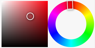
To control the colorable light there is an implementation via color Chooser. It is a visualization of the HSV color space with geometric color selectors like illustrated in the image below. On the left side, saturation and brightness are selectable by the circle selector. The implementation of the saturation and brightness area is based on the solution with linear gradients. On the right side, the hue value can be set via the rectangle selector. Beginning with a quadratic image. For each coordinate pair the angle value [0..360] is calculated. The angle value itself influences the hue fraction and the hue fraction is the main information to calculate the current color in the interpolation step. The result is a quadratic image with a color interpolation as content. To get a circle, the fitting form is cut via circle shapes.
The advantage of a hue circle compared with a hue bar is a better spatial distribution. In this case both elements have the same size and fit in the widget pane.
Multi Language Support
One of the important demands for the application, was to support multiple languages and provide a simple way to maintain the languages and add new languages without much implementation effort later.
Therefore the ResourceBundles from Java were used. A languages folder within the resources folder (src>main>resources>languages) contains three property files. The language.properties file contains all identifiers for strings which are used in the application. The two files languages_en_US.properties and languages_de_DE.properties then provide the translations for the specified languages. This way new languages can easily be added by just providing a new language file.
To be able to update the language during runtime an observer pattern was implemented. The class LanguageSelection was created as a singleton and can only be instantiated once. It extends Observable and is part of the Model section of the program. This singleton object now saves the current language selection during runtime and updates all Observers which are registered.
To be able to implement Observers which can be registered for the language updates, the classes ObserverButton, ObserverLabel and ObserverTitledPane were introduced. They store the language identifier which is the same as in the property files and implements the update-Method which is obligatory for an Observer.
Additionally the JPLanguage class was developed to allow saving and loading of a default language for the application.
The JPLanguage is not fully integrated yet. It may be merged with the LanguageSelection class in the future. Currently the available languages are also hardcoded in the settings pane. A more generic way would be to load all available language property files from a specific directory.
Theme Support
To support an easy way to style the application depended on the user needs CSS Styling has been used as much as possible to define the look and feel of the application.
JavaFX supports CSS styling and provides ways for loading CSS files or using CSS specifications inline in the normal java code.
In the BCozy class, two stylesheets (css files) are added to the scene of the primary stage. This way they are available for all children of the scene which are all the view elements within our application.
The division of the css files has the following reason: One stylesheet defines the shapes and sizes of all graphical elements of the BCozy program. The other stylesheet defines only the color and perhaps further features as fonts and so on. This way two stylesheets for different look and feels were developed but they only change the colors of the elements. It is always a trade-off between maintainability and flexibility. If one provides all css code in one file, the flexibility is huge but if one has to maintain two complete files it will be very hard to keep all changes synchronous in both files. By dividing the files and allowing the user to change only the parts in which he is actually interested in, maintainability is increased because layout changes regarding size and shape could be made in one central file.
Furthermore extracting sizes, shapes, colors, fonts and so on from the java code into the css code helps the developers to focus on their main tasks and allows designers to style the application independently.
If the theme is changed from within the application, this is done in the settings pane from the main menu. It triggers the static changeTheme function in the BCozy class which removes the current stylesheet from the scene and applies the new one. This changes the appearance of the application immediately and all is done in the background of the JavaFx framework.
During development the light.css theme was focused. Therefore the dark.css theme may be improved in future changes. Additionally just like the language selection the theme selection is also hardcoded in the SettingsPane. It would be more generic to load the theme files from a specific repository and dynamically create a list of the available themes.
Material Design Icons
To allow a scalable and appealing design an external framework was used to integrate material design icons from different sources. FontAwesomeFX 8.6 provides icons from 4 different fonts which are smoothly and arbitrarily scalable.
They have been integrated into a self developed container, the SVGIcon class.
These icons can be used for normal application buttons and labels but they can also be for the various device panes to illustrate their functions. The SVGIcon allows to combine two material design icons into one object by stacking them above one another. One can achieve nice effects if an icon is provided as an outline and as a filled variant this way. Furthermore the SVGIcon class offers methods to set and change (animated) the color and even to change the fore/background icon during runtime.
The drawback of this solution is that one can only use the icons of the supported fonts by FontAwesomeFX. Even though it is really a nice way to integrate professional icons into an application and offer the opportunity to scale them as much as you need because they are vector based.